

The pandemic has struck most of us so hard and travelling was one of the major field challenging to it. While I was surfing through the browser I was curious to know how business travelling is affected during pandemic and what was people's response on video conferences rather than business travels. Well here is what I found !

The response was actually very different and people had strong reasons for it. I was curious to know more about it and found out more problems and issue that a business traveller could face while in commute. So I eventually thought of making an application for an enterprise which could help their employees travel hassle-free. I targeted upon a hypothetical organisation and designed an application for the employees over there.
Vevoy is a multimillion dollar US based insurance company and consists of more than 50,000 employees. As their mode of business is based on insurance, the employees will have to travel several trips in order to meet and fix deal with clients. I have designed an application for the employees at Vevoy which helps them in travelling a hassle free business trip.
The employees at VEVOY faces troubles and issues while travelling abroad for business meetings representing their organization.
> To build an iOS Business travel application for the employees at Vevoy that helps in travelling for their business needs.
I believe that whatever the aim is, doing the right process is what it helps us to reach it. We just have to hold our vision and trust the process.

Apart from my assumptions to know more about the troubles and issues faced by business travellers I created a Generative Research Strategy to know about the:
> The common problems faced by travellers as well as business travellers.
> How does travellers deal with problems when they face it.
> Apart from the problems faced in what all sectors could I help in order to make a business travel smooth.
I conducted a secondary research through online sources to know about the above mentioned points. I proceeded to conduct a competitor/market analysis of the existing travel applications ; to know about their interface, features offered and customisation.

After conducting a competitive analysis I had to search potential participants for interviewing. After sending out a survey form asking about business trips to my connections whom I felt would have travelled for business. I received about 12 responses in which I filtered it upto 5. I made out a discussion guide for the interview and scheduled a meeting of 1 hour with these 5 participants individually. A contextual inquiry session was done with the potential users and I was excited to find out their problems, needs and goals.

After finding out the key problems, pain points, needs motivations from the participants all the data collected should be organised and segregated. These Key findings helped me out to get a brief idea of what actually the users would feel, think and do apart from my assumptions and that is why the research phase is very important while designing a product. After these I moved onto the second stage of design process.
After finding out the key insights from the participants that is to be solved is defined, I created a user experience strategy blueprint to keep myself organised about the further actions to be taken which included guiding principles, focus ares, aspirations and activities to be taken.

After making the the blueprint I did a brainstorming session which was divided into stages of a person travelling for business (i.e assigning of a business trip to the person returning back home after his business trip). This helped me out categorize a user's path and focus more on each step.

After brainstorming a customer journey map was build which included the real dialogues of users said during the interview which mentions their frustration, confusions, anger and happiness at each stage of their business trip. The customer journey map included User's actions/thoughts/feelings, user's goals during each stage, the channels that they follow, experience, problems and Ideas that could be incorporated in the application at each stage of a business trip.

After creating and analyzing the customer journey map thoroughly I now understood how my persona would be and created one.

Creating a persona helped me to make Point of view statements that led to the creation of How might we statements which helped in understanding the best possible solutions to build a Minimum Viable product. Apart from that I created a Feature Matrix by Impact-Effort analysis to prioritize the features according to the needs of the users. First I made an Impact effort analysis marking a number between 0 - 10 (0 being is the least important and 10 being the highest importance) of how much impact a particular feature would result to the user and another 0 to 10 marking on how much effort should the organization put in order to build the feature. After listing down the features and marking the numbers according to my assumptions I went back to the users and asked them to mark from 0 to 10 .

After making a feature matrix I understood which all features are in priority as well as what all features contribute to the MVP. I created a product feature road map which includes the features along with the priority given to each feature. Making a feature map helped me to categorise the features and I feel that this is not the end; while in the ideation phase prioritization can also change or a new feature could pop up. To make myself clear about the flows and architecture of the application I made use cases of different scenarios which made me realise the conversation between a system and the user.
After writing down the use cases I got a clear image of the application and started fleshing out to sketch different ideas. I feel that when I sketch in the initial stage rather than moving to lowfis I tend to explore more in different variations and patterns.

Working upon sketching helped me to understand various possibilities on ideation. Then I started working upon low fis digitally and more changes were done when compared to the sketching. I was a bit confused and worried upon this point thinking why my designs kept on changing while moving from one phase to another, but again I believed in my process and moved forward.
Low fidelity designs


Creating Brand Identity
After working upon the lowfis I had to give my brand a character. The name "Vevoy" came upto my mind by brainstorming words on trips. I was stuck upon the words "Voyage" and "Executive" as these both are the main keywords of my project and started creating names on that which concluded on "Vevoy" that is the last 2 letters of executive and first 3 letters of voyage.
I just had a simple logo in my mind which should be easily visible and communicable to the audience. Therefore I created a logo made out of letters and three variations were selected and finalised on the first one because of its clarity in reading and looked more futuristic.


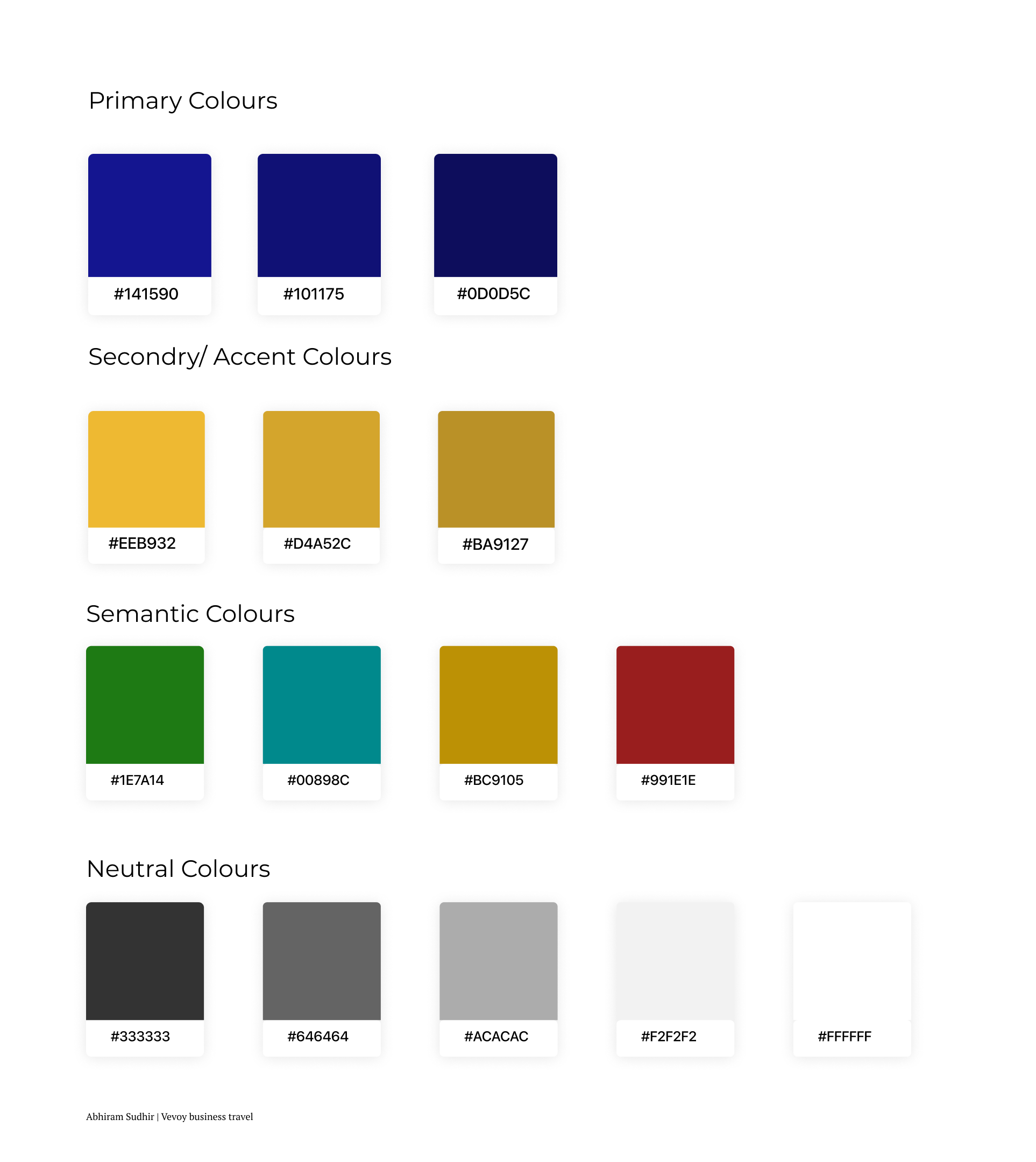
Primary colour is #141590. Darker shades of blue is the most popular colour choice for the top brands. It is thought to put people at ease, as it reminds them of the sky and the ocean. Blue is also associated with trust, security, and confidence which make a great combination for the brands that want these elements in their message.
Secondary colour is #EEb932. This warm colour is the shining example of friendliness and cheer. Brands which are seeking to draw in consumers with a comforting, warm embrace and youthful energy look towards yellow. In this project I added only a gist of yellow shade and the dominant colour is blue.
Semantic colours were chosen from colors.eva.design which helps in generating semantic colours by looking onto the primary colour chosen.

Serif fonts were choses as the main typo because it promote feelings of class and heritage, making them ideal when you want to create a company that feels “established”. Due to their classical nature, serif fonts carry feelings of trust and respectability, making them perfect for brand identities that revolve around authority and grandeur.


The usage of serif fonts on the left image is one way where I could showcase my typography. Using fonts that are of high pixels makes it easy for reading and stays with the class. The usage of buttons which had sharp edges in the right image was the exact form I had in my mind. When these both combine together I got a clear visual idea of how my application should be.
I created high fidelity designs as well as an interactive prototype in figma. The task flows observed in the prototype are
1. User onboarding
2. View Trips and itinerary
3. Style and Pack for a trip
4. Notification screen
5. Search for anything


I was actually satisfied upon myself on completing this project. This project taught me a lot in terms of research, design thinking, UX and UI processes. I am grateful to all my participants who helped me in the research phase which was the base of my entire project. To end it I believe in a famous quote by Salvador Dali - "Have no fear of perfection—you’ll never reach it.”